Responsive web design (RWD) is a web design approach aimed at crafting sites to provide an optimal viewing experience—easy reading and navigation with a minimum of resizing, panning —across a wide range of devices (from desktop computer monitors to mobile phones). This is the Wiki definition and its a good starting point to explain this post. More than ever we have been asked about mobile versions of websites and luckily JamJo is uniquely positioned to help because all our designs try to incorporate the best of responsive design techniques.
1. Responsive Design
A responsive website is basically a website which can adapt itself on different screens regardless of the device you are playing it on. You build one single responsive website and it resizes itself accordingly. This has a number of benefits because you are using the original design, it tends to be a little faster and a little easier to scale your website. A responsive design is a good place to start on most websites before diving into an exclusive mobile web app or a native mobile app design. This is a good example of a responsive design; H2 Compliance
Responsive Web design is the approach that suggests that design and development should respond to the user’s behavior and environment based on screen size, platform and orientation. The practice consists of a mix of flexible grids and layouts, images and an intelligent use of CSS media queries. As the user switches from their laptop to iPad, the website should automatically switch to accommodate for resolution, image size and scripting abilities. In other words, the website should have the technology to automatically respond to the user’s preferences. This does of course mean that certain design decisions have to be taken on the overall design of the original website, image size and layout is critical, advertising space that exists on full screen websites sometimes cannot be allowed for in the smaller designs on mobile devices (something even the mighty Facebook struggles with).
2. Mobile Web App
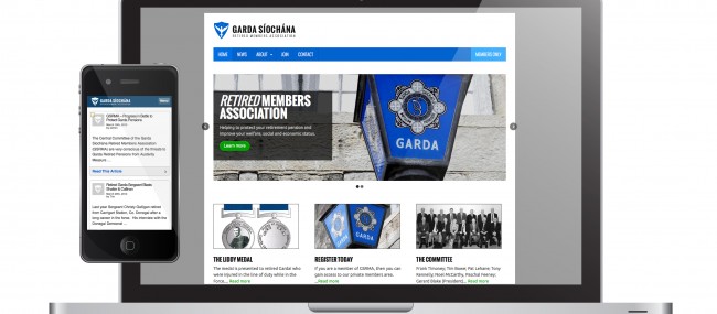
A mobile website is similar to a regular website and can be accessed with the help of different browsers, the only difference being it is created for small-screen devices exclusively. In the WordPress world of website design it ultimately is a new Mobile theme design for your website. Mobile sites are optimized for on-the-go users, contain limited (or rather, necessary) content and are lighter and faster than responsive websites. The advantage is you can download a Web App icon to your iphone, blackberry desktop and give a more native application feel to your site. Web-App mode delivers a native application-like experience on iOS devices. When visitors bookmark your site it is available in standalone mode without Safari wrapped around it. You can brand this experience also, choose your home screen icon, loading image, and more, and create a great Web App for your iOS visitors. A good example of this type of site is located here at the Garda Siochana Retired Members’ Association and also
3. Native Mobile Apps
Native apps are apps designed for mobile users using mobile devices, usually downloaded from a marketplace such as Apple App Store. There is a different native app standard for different platforms, requiring a new set of coding for each platform. Typically iOS and Android devices. This can be an expensive exercise to truely get right. You need to custom build the apps for the different devices and also make sure you are constantly updating them as new versions of Android and iOS operating systems get released. People typically tend to get their apps built but without any plans to update and iterate them over time, maintenance is critical!
The three methods outlined give you an idea for the techniques involved in creating a mobile web presence but each of them has its own advantages and disadvantages. Getting to know each of them deeply is a good idea for making an informed choice. This choice will ultimately come about from the type of website you have in the first instance.
Responsive Design versus the Mobile Web-App Design
When comparing these two, you absolutely need to focus on the main website purpose. If it is a website aimed at providing its users a mobile experience which involves quick decisions and buying and selling, then a responsive design can be a good choice. Mobile commerce or mCommerce is getting more popular, you cannot really do the vast array of displays needed in a native web-app mode in WordPress to achieve this so a responsive design is a great option. However, if you need to constantly add and update it with new posts, then a single mobile Web-App design site is a better option. This is because, when it comes to easy updating, mobile sites for WordPress are easy to maintain. If you have a simple blog type website (magazine, blog, news) and the blog is the main focus then a web-app mobile version of your site can certainly be a good choice as explained.
Also, it depends on what your budget is when you are planning to create a site. Realistically people tend to view a few pages of your site in the mobile view, forums and engagement elements are not really required on most mobile versions of sites. People tend to think a simple plugin will do the trick, not necessarily so, this plugin will need to be configured, optimized and branded to suit your website outlay. When it comes to optimization and SEO, and adding conversion and redirect codes, responsive design websites rule the roost.